“Florentine Plaster”

The incredible Florentine plaster is an easy, yet gorgeous faux finish technique. Still, after about twenty years, one of the best sellers. FP looks like a multi layer technique, but is not. Production is fast, easy and can not be compared to other textured techniques, due to inexpensive application. Contemporary, modern or electic, take your pick, Florentine Plaster will always be the "talk of the party"

“Croco”

An exquisite crocodile leather look alike faux finish. Designed and created for a famous baseball player. The king size bed, custom made to highlight this faux wall finish. Mediums used: Water Putty, Olive oil, gift-wrap etc.

“Grandeur”

(`granjər,`granˌdyo͝or/) noun: splendor and impressiveness, especially of appearance or style. The dictionary says it all. This grandiose faux finish was created with MM metallic plaster, gold powder and assorted MM metallics.

“There's No Crying in Baseball”

An extremely fast and effective wall glazing finish resembling a baseball. Created with paint only.

“Tuscany”

I found this beautiful faux finish in Florence, Italy in the Orsini Palace.

Welcome to My Home

Hello and Welcome!! My name is Heidi and one of my passion is faux painting. However, there are otherpasions and I live them daily. Take your pick. Interior design, decorating on the shabby side, gardening, herbs, fashion, culture and and last but not least "Style". In my world, the day should have 48 hours and more.

I am here to share some of my adventures with you, because I love to share and teach. I hope that you come by often and stay a while. Thank you for sharing your time with me.
Showing posts with label Hot Trends. Show all posts

Saturday, March 24, 2012

Ostergrüsse aus den USA

Hallo meine Lieben,


Hatte heute ein bisschen Zeit auf der Internet herum zu surfen. Ich dachte mir, dass es vielleicht für Euch interessant wäre zu sehen wie kreativ die  "Amis" sind. :)


Courtesy of http://todolwen.blogspot.com

Courtesy of http://todolwen.blogspot.com

Courtesy of http://todolwen.blogspot.com
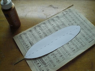
Ich habe  die folgende tolle Anleitung für eine Papierfeder bei Karen Bailey  gefunden. Kurz und gut... ich habe mich in diese Federn verliebt. Ich bin froh, dass ich sie noch vor Ostern gefunden habe, und hoffe,  dass diese Federn auch Euch gefallen. Viel Spass beim kreativen werkeln.

So geht's


Werkzeug

Osterfeder  (Notenblätter,Lexikonblätter oder alte Bücher)
- Schere
- Weissen Leim
- Cutter ( Drahtschneider)
- Draht (  ca 45cm lang)
- Festes Papier ( 240 - 260 g)
- Bleistift

Courtesy of http://todolwen.blogspot.com
Lade hier die Schablone herunter.
Courtesy of http://todolwen.blogspot.com

Der Draht (ca 35 cm/20cm) wir so gebogen, dass ein Ende ungefähr 3 cm länger ist.


Courtesy of http://todolwen.blogspot.com

Der Draht wird auf das ausgesuchte Papier geklebt. Nicht vergessen 3 cm unterhalb des Papiers den Draht hervor schauen lassen.

Courtesy of http://todolwen.blogspot.com


Jetzt wir ein zweites Blatt aufgeklebt. Trocknen lassen.


 Die Kartonageschablone wird  genau auf das Papier gelegt.


Courtesy of http://todolwen.blogspot.com

und die Umrisse der Schablone werden mit Bleistift übertragen.


Courtesy of http://todolwen.blogspot.com

Courtesy of http://todolwen.blogspot.com
Jetzt werden  die Schablonen zu Federn zugeschnitten, und voilà   

Die Federn sind Fertig!!!!


Viele liebe Grüße aus den USA


Eure 


Thursday, September 8, 2011

A new Face for your Bookshelf

Yesterday I started to re-do book shelves for one of my clients. Here are the step by step instructions to follow along, transforming  your book shelves and any  other wood work.


Supplies:
Latex eggshell paint
Water
Chip Brushes
Rags
Cardboard

Glaze consistency: Mix one quart of paint with one cup of water.


Colors: On a fan deck choose 2 colors of the same color range. Select 2 colors, medium and dark. I use the third; and fifth hue. For the highlight color mix the fifth color with white.


Aging glaze: I usually use a dark brown or dark grey depending what look I want to achieve. However, you may also use the last color on the fan deck.

Dry Brushing:
Submerge paint brush into paint. On a piece of cardboard work the paint into the brush. Do not work with a fully loaded brush. Remember " Dry Brushing".


When you are glazing make sure to retain some of the previous coat. You want to achieve an orderly distressed look with all  colors visible.

Step One:
Dismantle the bookshelves.


Step two:
Sand thoroughly and dust.


Step 4
Apply a very dark glaze ( I used a black green glaze). Let dry.


Step 5
Apply dark green glaze. Let dry.
Step 5 and 6

Step 6
Apply a medium green glaze. Let dry.

Step 7
Apply highlights with the lightest glaze. Let Dry.


Happy painting until next time 


Monday, August 8, 2011

It's all about color - How to create your color scheme like a professional

Working as a faux finisher and decorative artist,  I have learned that  some of us are afraid of color, although color is the most important aspect of interior design. Choosing the right colors doesn't have to be difficult. Here are some simple  rules you can apply and hopefully you will be able to step out of the color la, la land.


My last blog  tried to get you started in the  color selecting process. Now I am trying to explain the next steps, so you will be able to make the right color decisions. After all, our homes are full of color and we want to feel comfortable in our homes.

Beside warm and cool colors we differentiate in tone in tone(monochromatic), analogous, complimentary and split complimentary color schemes. To make thing less confusing, I only will discuss the main and most important (IMO) schemes. 


Monochromatic: Use tints, shades and and tones of the key color. Tone in tone or monochromatic is balanced, quiet and visually pleasing. No high energy level in this  color scheme.
Monochromatic, tone in tone using shades, tints and tones of the key color


All Images of Paula Grace Designs
 If the quiet simplicity and soothing effect  of the tone in tone color scheme is letting you fall asleep during day, step it up a notch to the analogous color scheme.


Analogous:
The analogous color scheme uses colors which are adjacent to each other 


Analogous cool design

Analogous warm design

Analogous warm design
The analogous color scheme uses one dominant color with punches of sumptuous richness. This scheme is not as vibrant as the complimentary one and one must be careful not to overdo it with lots of hues of too many colors. This color scheme looks much richer then the monochromatic one.


I hope that these tips on color design  selections  make your life a bit easier. Stay tune, more to come soon.


All my Best,


It's all about color.... New trends for 2012

In March of this year Pantone, the world renowned color authority,  published nine color palettes. Nine distinctive palettes, each with a much thought about name. Don't ask me how they dream up these names or in what relationship they stand to each other, because I just don't know.

Every year I am excited when the new color trends are published by Pantone. I was raised in the fashion industry, so color always has played an important part in my life. For me it's all about color, style and fashion. If you want your home to be trendy, all you have to do is look at fashion fabrics. I guess, I am fashion forward because my PJ's fit the 2012 Pantone "Back to Fuchsia" palette


Courtesy of "Nidhi" Pattern, Colors and Design

My "Fuchsia" PJs


and my blue PJs match the "Indigo Effects" palette.


My Indigo Pj's


Personally I love the "Resilience" palette. Possibly because I always had to be resilient.


Resilience 
The Oil Yellow, subtle and quiet and the peaceful Oasis green are really  fulfilling my color sense. Resilience or stress free? Who knows? All I know is that I felt compelled to buy some blouses in exactly these colors and I am raking in compliments.  
Subtleties
Transcending

Reflection

All color palettes are courtesy of "Nidhi" Pattern, Colors and Design
Maybe you will be inspired with these new colors and are ready to add some to your home decor. You always can pick up a few accessories and change the look of your home.


Until next time.


All my best,


xoxo 


Color is the most powerful way to change and coordinate the look and feel of your home.  

Wednesday, June 1, 2011

Decorative Painting - Diary of a MacKenzie - Childs Library Table

Sometimes I really get mad at myself; especially buying "things" with the re-do, decorative painting and faux painting  thought behind it. Of course,  I could have a big sale offering my hand painted wares. Never happens!!! Well, I am going to change this now!

I love MacKenzie - Childs furniture. I am sure that you have seen these fun pieces, intricately hand painted. I am also sure, that many of us can't afford them. Although, they are worth every penny.

Since many moons ago, I wanted to create a piece like it; just to have one. I always wondered, if I could do such fun and intricate work. I finally made up my mind. I will be doing a piece, risking that terrible thought of "failure". I am going to jump over my own shadow.

I selected a nice, small table, which I stole for $5.00 at a local flea market. An intricate style  in itself, thus it will make the painting very hard. But I am trusting on your support, cheering me on, doing one table leg at a time
My library Table ... Ah, so pitiful
First things first: I have lightly sanded the table followed by a light wash with lacquer thinner. You must wear a mask, or better yet a respirator and protective glasses. 


That being done,  I gave one leg 2 coats of black paint. That's something, don't you think? A step in the right direction. Gee, it's hard to be scared and not knowing what to do. But, with help from above, I am determined to complete such utterly scaring project. Stay tune and be safe.

Sunday, May 29, 2011

Granit Küchenplatten - mit Farbe

Jedes Mal wenn Sie in Ihre Küche kommen, werden Sie mit Ihren alten und verbrauchten Arbeitsplatten konfrontiert. Wäre es nicht schön, diese traurig aussehenden Küchenarbeitsplatten zu einem neuen Leben erwecken. Wäre es nicht schön, wenn Sie nicht in derselben Lage wie unsere Regierung wären, und müssen nicht unter schwersten Budgeteinschränkungen mit unserer verbrauchten Wirtschaft mithalten?

Nun, im Gegensatz zu unserer Regierung habe ich einen Zauberstab. Ich werde Ihre Zauberfee sein und Ihren Wunsch, trendige Granit Küchenplatten zu bekommen, erfüllen. Mit Farbe können Sie sofort Ihre Wünsche erfüllen und Ihren Küchenarbeitsplatten sofort eine ganz neue Stimmung verleihen. Und das Beste daran, es ist preiswert, Sie können es selber machen und Sie können Ihrer Kreativität freien Lauf lassen. Ich spreche hier von Granit. Granit ….. mit Farbe kreativ gestaltet. Ihre Freunde werden Sie  beneiden.


Natürlich müssen wir einige Vorbereitungen treffen. Keine Angst, bis heute Abend werden Sie Granit Küchenarbeitsplatten haben, die den Test in jedem trendigen Einrichtungsmagazin bestehen.

Sie brauchen:
.
                                  Grundierung
                                  Ammoniak
                                  Schleifpapier
                                  Lappen
                                  Farbroller
                                  Schwarze Acrylfarbe


So wird’s gemacht
1. Arbeitsplatte abkleben
2. Oberfläche abschleifen
3. Mit Ammoniak waschen
4. Gründlich trocknen

5. Grundierung  mit  dem Farbroller  auftragen
6. Trocknen lassen
7. Schwarz streichen und trocknen lassen
8. Leicht abschleifen
9. Schwarz streichen und trocknen lassen


Jetzt können Sie mit der Granit Lasur beginnen.


Granit Lasur:

Sie brauchen


3 Kontrast Latex- oder Acrylfarben (Ich habe Schwarz, Weiß, Rot Oxide und Gelb benutzt)
Zeitungspapier
Pappteller
Acryl Hochglanzlack
Wasser
Natur Schwamm


Benutzen Sie nur Natur Schwämme die für malen geeignet sind.

Schritte:.
1.    Verdünnen Sie die Farben auf den Papptellern bis Sie eine dünne Lasur haben.
2.    Mit dem feuchten Schwamm nehmen Sie die erste Farbe auf, dann kurz auf das Zeitungspapier tupfen und danach auf die schwarze Oberfläche.
3.     Betupfen Sie ganz schnell und leicht die komplette Oberfläche mit dem Schwamm. Waschen Sie  den Schwamm aus und wiederholen Sie diesen Vorgang mit allen Farben. Falls Abdrücke vom Schwamm zu sehen sind, müssen Sie weicher arbeiten. Solche Abdrücke verraten leider das hier ein Anfänger am werkeln ist! Nun lassen Sie Ihr Meisterwerk trocken und tragen danach  drei mal Acryllack auf. Fertig


Viel Spaß, ich werde mich freuen wenn Sie sich bei mir melden und erzählen wie toll Ihre Küchenarbeitsplatten geworden sind
.


Thursday, May 5, 2011

At Large in the US - with Modern Masters


Rust - I love it, maybe because I am a bit rusty already. Also  a faux finish  which is going to stick.

I have tried many mediums to create rust and actually I have come up with my own creation. However, if you would like to have an easy  and no brainer way, you must choose The Modern Masters Rust Activator coupled wit their Iron Paint. Yes, they do actually make iron paint. 


I have worked with Modern Masters products since 30 year and I absolutely love their line. 
The quality of their products is unsurpassed, especially the metallic line . Although I still miss the metallic powders they used to offer. Do yourself a favor and hop over to a truly a great product line. You will also find lots of inspiration and best of all recipe cards. So go on over..... I dont mind.


Here are a few examples I have created with Modern Masters

From PVC Pipes to Fireplaces


Mediterranean Slate Backsplash


Before

After

Ceiling Medallion


A Golden-Bronze Foyer. Spetecular

Shimmer stone mixed with burnishing gold and Activator 

If you any question please feel free to call their customer service and again unsurpassed help will be available.


Happy painting,